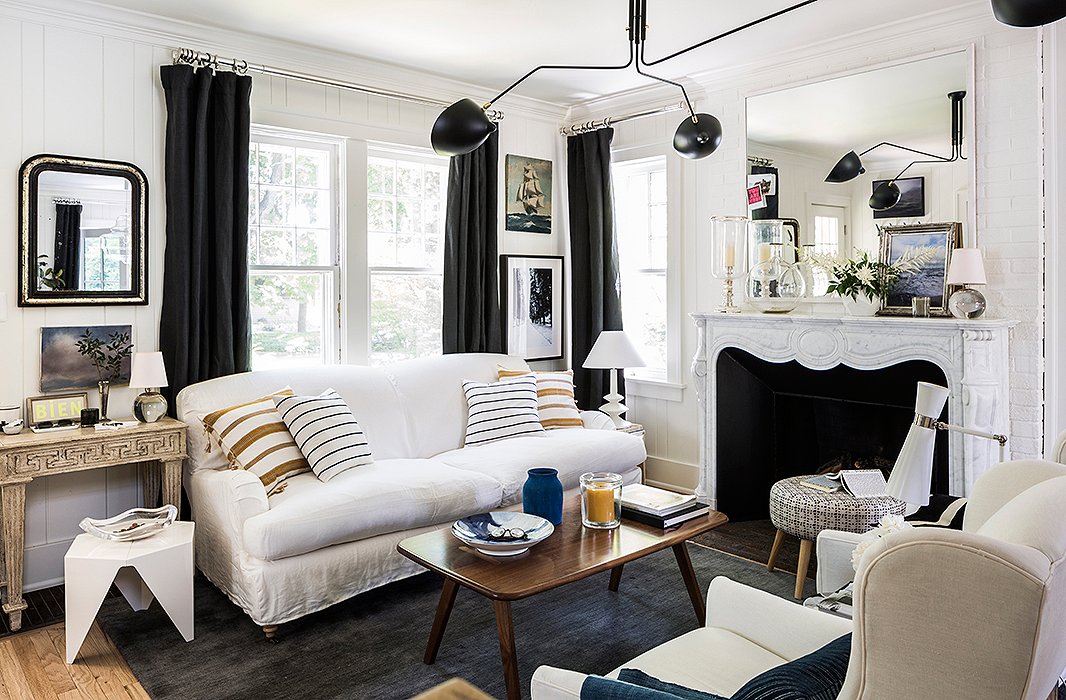
One of the most fiendishly difficult things to get right in interior design is an artful mix of pattern, colour, texture and design influences. Some of the very best design schemes have a layered and curated quality that feels as if it has been built up over years. While this style may look effortless, anyone who has tried to emulate it will tell you it is anything but.
Enter Michelle Adams—known to us for introducing groundbreaking digital design magazines Lonny and TRADhome and reinvigorating Domino magazine, among other achievements—and her fresh and sophisticated home in Ann Arbour, Michigan.
Following a move to Michigan from New York, Michelle bought a classic 1920’s Colonial ‘Fixer Upper’ in a historical neighbourhood and set about putting her unique stamp on it. “I really wanted to mix a whole bunch of different influences that I have from traveling for so many years,” Michelle says. “I wanted them all to be sort of tied together by one common thread, and that’s my love for being near the water—whether that’s the ocean or one of the Great Lakes.”
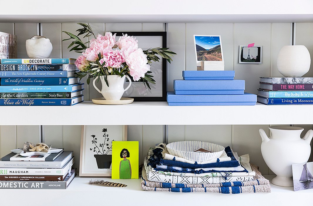
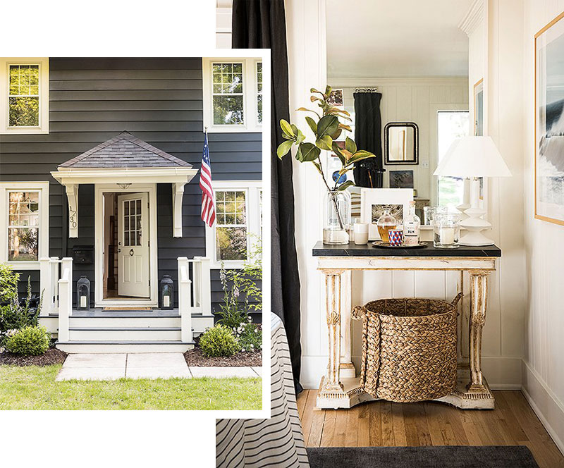
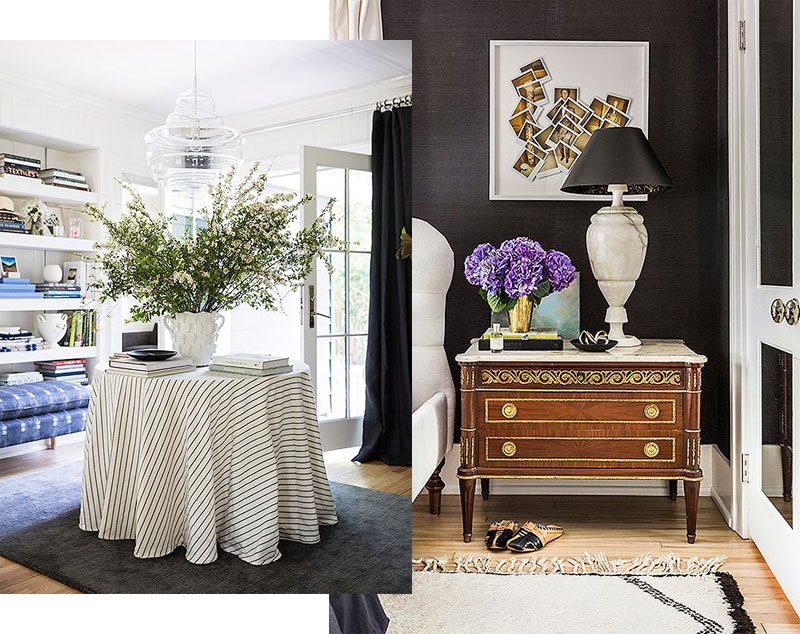
You can see Michelle’s love of being near the water reflected in the subtle blue and white tones she has used, especially in her living room. This space also acts as a foyer and central hub with doors opening to the front and back of the property. Other elements such as generous baskets, white beadboard panelling, simple window treatments and stripped wooden floors also add a sense of breezy beach style.
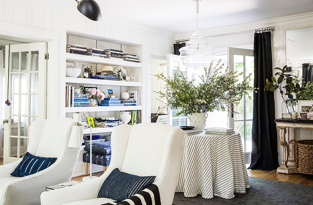
In the living room, Michelle has taken her design cues from one of her favourite architects and designers, Michele Bönan, whose elegant portfolio of work includes JK Place Capri. Wingback chairs—a hallmark of Michele’s interiors—are mixed with mid-century pieces and a Carrara marble fireplace provides the focal point. This really is a masterful mix of styles which works only when blended together by someone like Michelle with extremely good taste and an innate understanding of design.
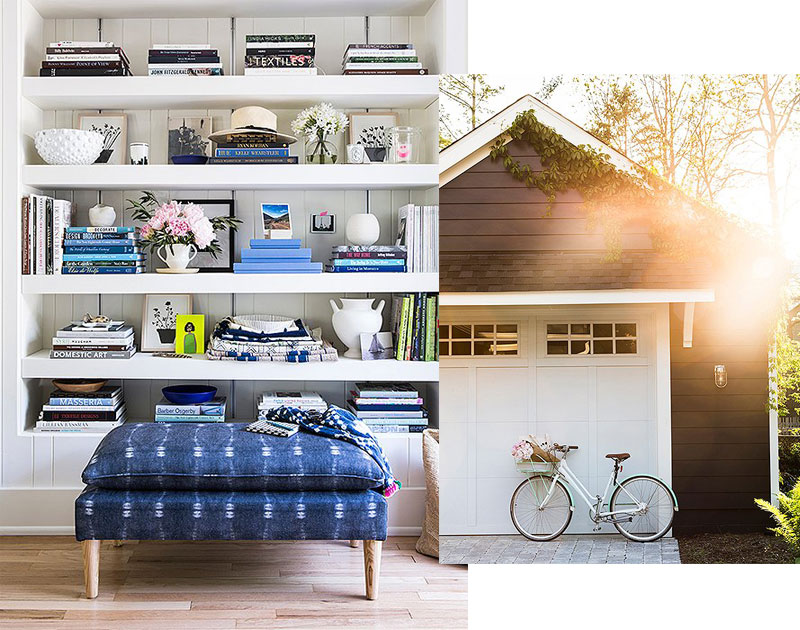
It comes as no surprise that Michelle studied Textile Design, as fabrics are a key component of the design of her home and another reason it works so well. One of her favourite pieces is the indigo upholstered bench that is placed in front of the statement shelves in the living room.
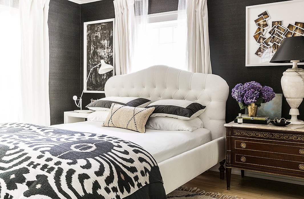
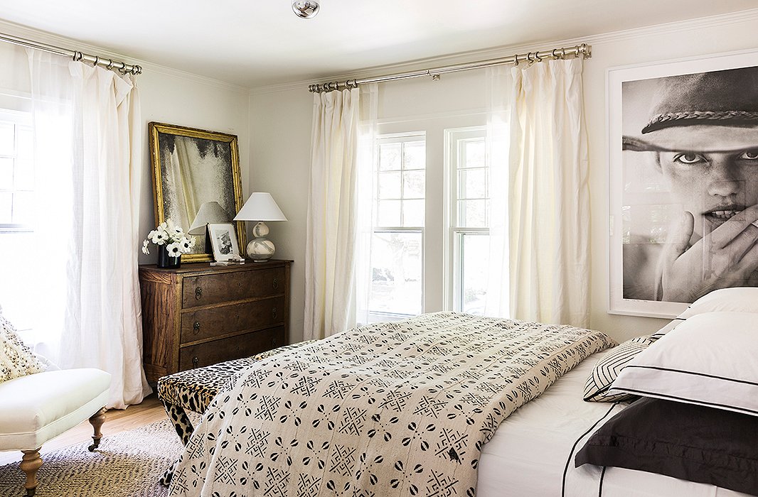
Michelle is also brave with colour, choosing to paper her master bedroom walls in a very dark, almost black, grasscloth by Ralph Lauren. Adding a white upholstered headboard and alabaster bedside lamps makes for a striking and chic mix.
This balancing of light and dark tones continues throughout the house and even features on the exterior which has been painted a charcoal grey with crisp white trim. Not only is the exterior striking in this colour, but the use of a dark tone is a clever design trick which helps to make the front porch recede as Michelle felt it was slightly out of proportion with the facade.

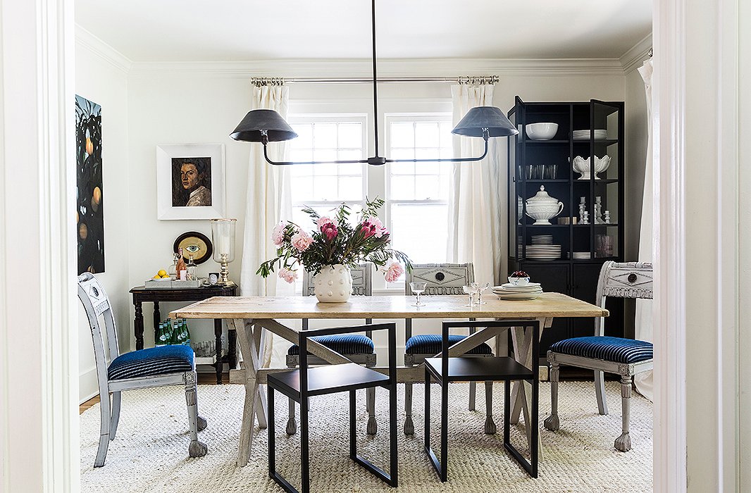
The final design element which makes Michelle’s home feel very personal and special is her choice of artwork and mirrors. Hung on walls and propped up on shelves, the key word again is ‘mix’ and you can see a combination of modern with vintage, black and white photography, illustrations and abstract pieces, all of different sizes.
With Michelle now working as a consultant for creative businesses and partnering on design projects with brands such as One Kings Lane and Skyline Furniture, we can’t wait to see what she does next . . . —Louise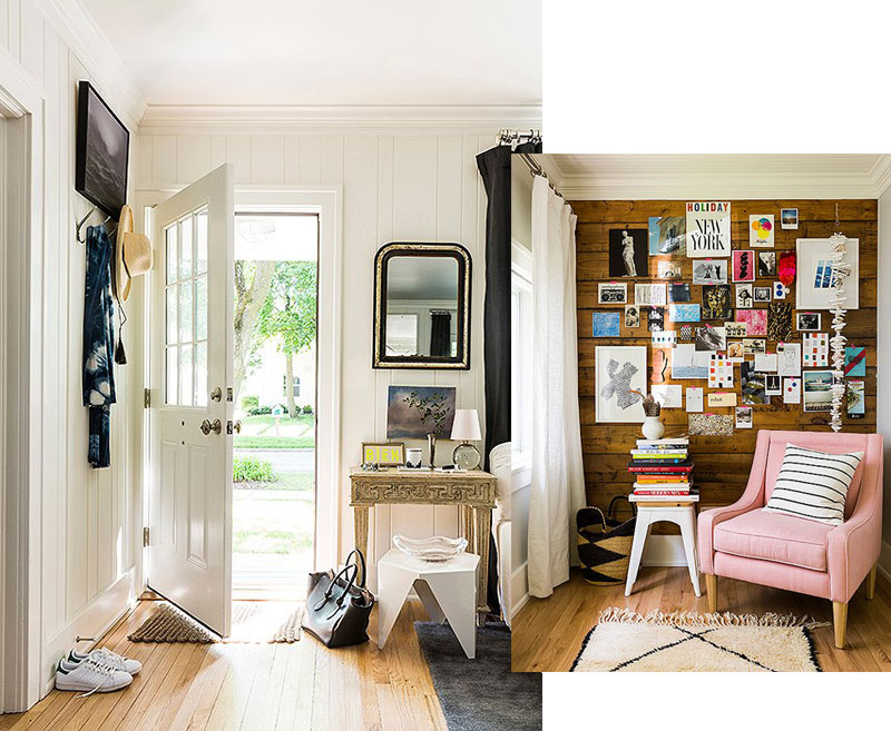
PS: You can see some inspiring ‘Before & After’ shots of Michelle’s renovation at House Beautiful.
Images: All via One Kings Lane