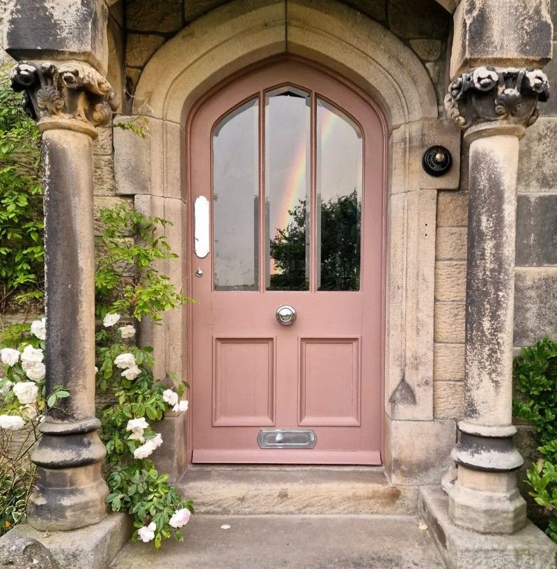
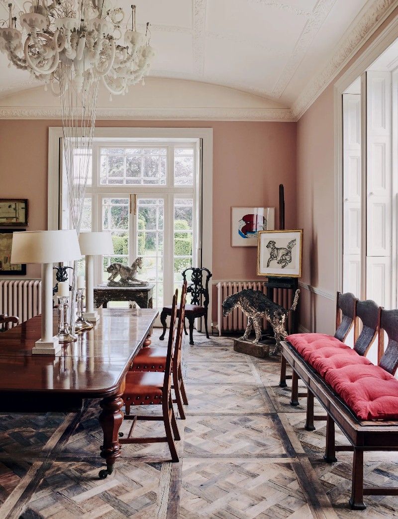
WHEN I WAS little, pink was my absolute favourite colour. Although I like to think I’ve grown out of it and now tell people my favourite colour is black (which is true), pink still holds a special place in my heart.
IT MAY SEEM unconventional at first to choose this range of colors in springtime, when others are opting for shades of green and daffodil. However, when you consider the muddy fields and the still bare branches awaiting their new leaves...
PERHAPS IT IS the shortening days that fade even before 7:30 now, or the evening chill that flutters leaves and creeps in before suppertime. Whatever the reason, we find ourselves drawn to deeper, darker hues lately, and especially to a variation of pinkish brown (or brownish pink, if you like) that we seem to be seeing everywhere lately ...
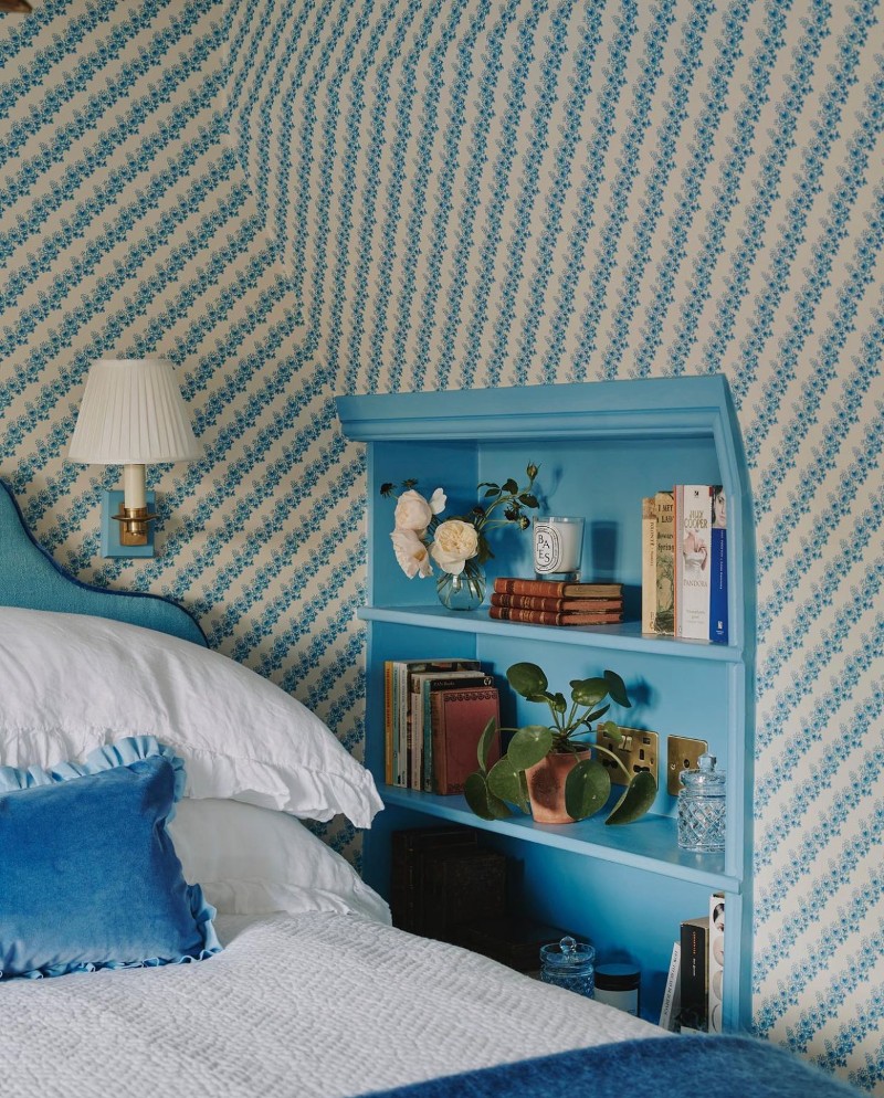
WHEN I WAS little, I would tell anyone who would listen that the my favourite colours were pink and purple. My little sister (who was always by my side) would chime in that she liked blue and black. Being unabashedly girly, I never favoured those colours and wore a steady wardrobe of preppy pink for as long as I could. Fast forward to the future and black would be a firm wardrobe staple, but blue, well I never ever really took to it⏤that is perhaps until now?
I HAD BEEN MEANING to paint the living for a while now⏤something warm and pinkish by Farrow & Ball⏤Pink Ground or Peignor or Setting Plaster. That is, until I came across Edward Bulmer Natural Paint on Instagram and discovered that it was eco-friendly. All of their colours are created from just 12 earth and mineral pigments using gentle, plant-based chemistry with absolutely no pollutants or harmful toxins. Before I continue, I should tell you that this is not a sponsored post.
THERE HAS BEEN a definite shift in the light since spring has arrived—not just since the clocks have gone back, but also with the amount of sunny days there have been. The clouds of winter days seem to have faded into clear and bright skies and everywhere ...
SOMETIMES THE BEST way to see upcoming trends is through a scroll on our Instagram feed. Lately, we've been seeing warm pinks especially in leather jackets, and often paired with buttery yellows and rust. There are also soft, feathery pinks as well as bold magenta, icing sugar shades as at Elie Saab and dusty, eighties shades on the streets of London. Scroll through for our favourite ways to wear this always lovely shade...
THERE ARE late summer whites and early autumn whites, but perhaps our most favourite are the Winter Whites. Here is a beautifully curated moodboard of a few things we love this holiday season—coats and cable knits and cosy cardigans; table settings and turtlenecks and tufted headboards; boiserie and leather totes and so much more...
A little late-summer colour inspiration in shades of satin and dusky pink: the loveliest shoulder-less bridesmaid dress, a cool drink on a summer’s day, and breakfast tables overlooking a mountainside…
Call it cream, fawn, or unbleached silk, Tuscan, buff, camel, khaki, desert sand, French beige or ecru―BEIGE IS BACK and it's fashion's new favourite shade. And despite its reputation, this pared-back hue is anything but boring. Sophisticated, classic, understated, and elegant, it was first spotted on the streets at Paris Fashion Week Autumn/Winter 2019 and we can't get enough of this the versatile and timeless colour. Here are a few ways to wear this chic shade...
EVERY YEAR around this time, when the holidays are over (the memories of fairy lights and sequins fading) we're back at work and it's a brand new year, we become hopelessly drawn to winter white.
WE HAVE LONG been fans of white, for summertime, for wintertime, and of course, for autumn. This season, however, it seems as if everyone else has fallen for it as well, for on the streets of New York, London and Paris, there flashes of eggshell and ecru, glimpses of ivory and cream, flutters of pearl and beige.
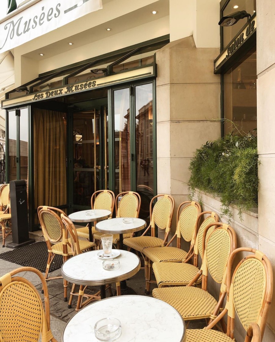
AT EVERY SUMMER'S END, we feature a round-up of the last of the summer whites. It's a wistfully beautiful compilation of all the things we love best -- ruffled white dresses with wicker, and boat rides and bicycle rides and sun-drenched terraces; waves crashing on sandy beaches, museums and French cafés, wide straw hats and belted linen dresses, top knots and golden skin, and that perfect lackadaisical late-summer vibe...
THERE IS A LINE in Ernest Hemingway's A Moveable Feast that says, “When spring came, even the false spring, there were no problems except where to be happiest”, and that is how we're feeling at this very moment, after a walk in the palm-tree laden jardins ...
According to colour theory, RED is an emotionally intense colour. The colour of fire and blood, it is often associated with power, strength, determination, energy and war. But it also associated with passion, desire and sexuality, love and joy.


